I find flag design to be very interesting, and I’m constantly surprised to see how much bad flag design there is. I credit/blame the 99% Invisible podcast for giving me this appreciation.
It started with the Vexillonaire episode. I learned so much from it — first of which is that vexillology is the scientific study of the history, symbolism and usage of flags — including the North American Vexillological Association’s criteria for good flag design:
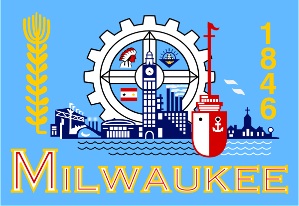
- Keep It Simple (The flag should be so simple that a child can draw it from memory)
- Use Meaningful Symbolism (The flag’s images, colors, or patterns should relate to what it symbolizes)
- Use 2 to 3 Basic Colors (Limit the number of colors on the flag to three, which contrast well and come from the standard color set)
- No Lettering or Seals (Never use writing of any kind or an organization’s seal)
- Be Distinctive or Be Related (Avoid duplicating other flags, but use similarities to show connections)
It’s amazing to see how many U.S. state flags don’t follow these rules — most are just the state seal stuck on a flag. The Washington Post had a humorous article on this topic called “Every state flag is wrong, and here is why.” Though some our state flags are well-designed (in 2001 the North American Vexillological Association ranked every U.S. state and Canadian province flags…I personally would’ve given Texas the top spot) most are pretty terrible.
Roman Mars (host of 99% Invisible) gave a TED talk about flag design. It’s basically the flag podcast but with visuals. Definitely check out this video (below) — it’s far more interesting than a discussion about flags should be. And you’ll never look at flags the same way again.